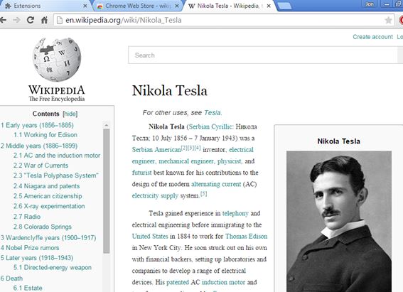
Here’s a list of 5 Wikipedia beautifier extensions for Chrome which you can use to change the layout and the appearance of Wikipedia articles so that they are easier to read. Wikipedia formatting is a bit unusual, and if you would like to make it more readable, then the following extensions are for you. They are going to change the layout of the page, remove links, sidebar, etc. This will put more focus on the text itself, making it more enjoyable to read.
Readable Wikipedia by Nick Rowe
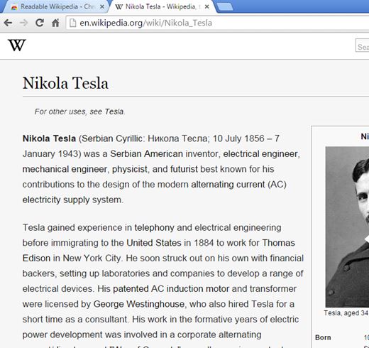
Readable Wikipedia will automatically change Wikipedia pages as soon as the extension is installed. What’s going to be changed is pretty much everything that I mentioned in the introduction.
Sidebar is removed, as are article links. Text padding is increased, and the colors are tweaked, but only a little bit. Background is grayer which makes the pages less strenuous on the eyes when reading at night. Don’t forget that this type of formatting is also better suited for printing. At the very least there’s no need to manually remove all the irrelevant parts of Wiki articles, like links.
Get Readable Wikipedia by Nick Rowe.
Readable Wikipedia by Ponychicken
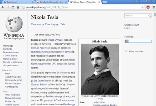
Readable Wikipedia by Ponychicken doesn’t strip down Wikipedia pages as much as as Readable Wikipedia by Nick Rowe does.
For starters the left sidebar is there, as are the links. Text has padding and it’s not as wide as it normally is, so you won’t get lost in long rows of text. Not only that there’s a left sidebar, but you also get a right sidebar where there’s a font size tweaker, for increasing and decreasing the size of the text.
Get Readable Wikipedia by Ponychicken.
Also have a look at How To Get Modern Interface for Wikipedia.
Wikipedia Beautifier
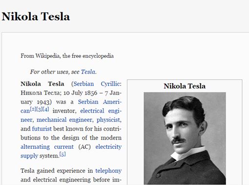
Wikipedia Beautifier is a sort of a great mix of the two previously mentioned Wikipedia beautifier extensions that I mentioned. It’s going to make the Wikipedia article more compact (not as wide) and make the surrounding elements (sidebar, header) transparent.
Sidebar and the top header are activated on mouse-over. Just move your mouse over to left part of the screen and the sidebar is going to pop-up. Same thing goes for the header. Text still has links, but padding is increased and so is the spacing between letters so it’s easier to read.
Get Wikipedia Beautifier.
EasyWiki
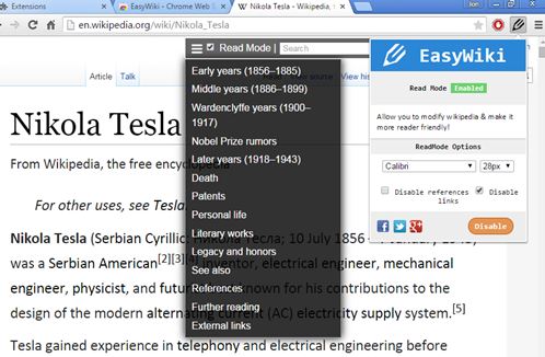
EasyWiki changes things up a bit more differently. It reformats the entire Wikipedia article so that text is in the focus. What does this mean?
Well it removes the table of contents and moves it to a floating toolbar at the top. Text size and spacing is increased, and it’s also going to remove or rearrange images, to give more room to text. Extension needs to be activated using the top right corner manager, see image above. Font type, size, links and references can be additionally tweaked/removed.
Get EasyWiki.
Also have a look at 5 Free Wikipedia Extensions For Google Chrome.
Enhanced Wikipedia UI
Enhanced Wikipedia UI moves the table of contents to the left sidebar and it improves text formatting.
Paragraphs are going to get indented, text formatted more nicely (spacing increased) and the entire article is compacted, so that the text doesn’t go on forever. Sidebar with the table of contents stays on-screen as we browse the article, making it easy to switch between paragraphs.
Conclusion
You can’t go wrong no matter which one of the 5 Wikipedia beautifier extensions from the list above you choose. They will all help out and make it easier to read Wikipedia articles. Let me know which one you ended up using in the comments down below.
