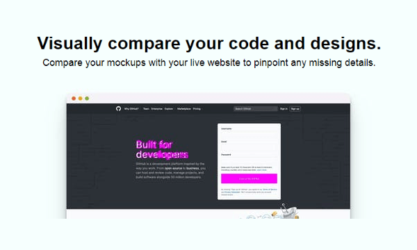
This article covers a method to visually compare mockups with live websites to find design flaws. There are two main things in building a website; creating a mockup and then coding it into the actual website design. Coding a website design is a complicated task and there is a fair possibility for developers to miss out on something from the mockup. It can be a missing element, wrong alignment, or anything. Matchstick.xyz is a free tool that offers a solution for this.
This is a tool to compare the mockups with live websites visually. All you have to do enter the website URL and upload the mockup to this tool. It aligns the mockup on top of the actual website and makes it easy for you to highlight the missing design details from the website. Anything from a mockup that is not on the website sticks out in the comparison. You can compare the mockup and website for various devices type and screen dimensions.

Also read: Create Animated Mockups with Free Open Source Design Tool
Visually Compare Mockups with Live Websites
Comparing mockups with live websites is easy with Matchstick. You simply have to visit the website to access the tool and enter the comparison details there. There is no need for an account, you can use this tool right away on the website.
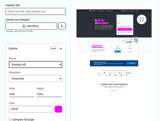
The tool has a giant preview section with a side panel on the left side. You have to enter your comparison information in the side panel and then it shows a visual comparison in the preview section. The first thing you have to enter is the URL to the website which you want to compare with a mockup. After that, you have to upload the mockup file. You can only compare one page at a time so mockup upload is also limited to one. The mockup should be a PNG file within 50MB in size.

After adding the URL and mockup, click the arrow button alongside the mockup upload to get the comparison. There is also an advanced options list where you can configure the device type for the comparison. You can also select the orientation accordingly to your data and customize the dimensions as well. The list also has a color option with a hex code entry. This is a color shown on the comparison to highlight the elements. You can change this color to make it easily noticeable by changing the hex value for it.
Closing Words
This is how you can visually compare the mockups with live websites and pinpoint missing design details. This is a handy tool for developers as well as designers to easily highlights the missed out elements, design errors, and misalignments in teh final design. This tool is a free online easy-to-use tool that can be used while developing the website saving hours of quality check and re-coding.