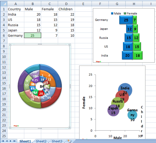
PlusX is a free Excel add-in to create Gantt, Waterfall, Mirror, Double Donut, and bubble charts using the data available in Excel. So, the add-in is surely handy when you have to check your data in a colorful graph. All you need to do is select rows and columns and use any of the available chart options. The minimum number of rows and columns requirement may vary by graph types.
The most interesting feature is that a chart is updated automatically when you edit the data. So, you don’t have to panic to create the chart from the scratch if you update the Excel data. A bonus feature also comes with this add-in using which you can check live fx rates (foreign-exchange rates) for your country or selected country.

Above you can see the different types of charts generated by me for a sample data with the help of this Excel add-in. You can also resize a chart and remove it when not needed. When you save your Excel worksheet, the chart is saved with it. Saving the chart(s) individually as an image file is not possible.
Here are some other interesting Excel add-ins you can try:
- Create Radial Bar chart for table data.
- Bookmark your favorite Excel files and folders.
- Generate Sunburst visualization for data.
How To Generate Waterfall, Mirror, Bubble, and Gantt Charts in Excel?
Step 1: Use this link to grab the setup of this Excel add-in. This add-in is available for 32 bit as well as 64 bit Excel and for Excel 2007 and later versions.
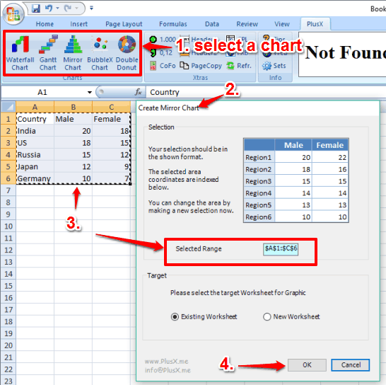
Step 2: After installation, open Excel and you will find a new tab in the ribbon menu with the name ‘PlusX‘. Access that tab and you will be able to see all the supported charts and fx rates for a country. Now open an Excel file whose data you want to convert in a chart.

Step 3: Click on a particular chart type. A pop-up will open for that chart. That pop-up shows the format or I say an example about how you should select rows and columns. Also, you can choose whether you want to generate the chart in the existing worksheet or in a new worksheet. Set all these options and then click OK button.

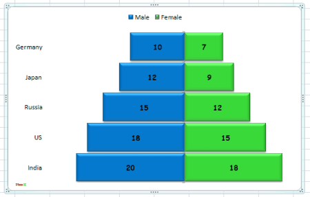
That’s it! The chart for the selected range will be in front of you. Now try to edit some values in your Excel sheet. You will notice that changes are updated automatically in the chart.

The Verdict:
PlusX is indeed a fantastic add-in. Creating the charts for Excel data is so simple. Also, the generated charts look really beautiful. The feature to automatically update the charts makes it perfect.