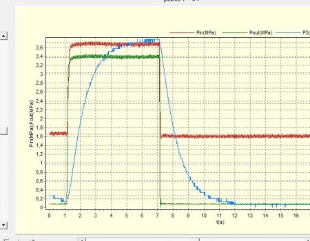
KaPiGraf is a free portable diagram generator for Excel which you can use in order to generate diagrams and charts from random values inside your spreadsheets following pre-configured mathematical functions and selected values. Next to this very unique function, KaPiGraf can also be used as a Excel editor, because in order to generate diagrams, you’re either gonna have to open up spreadsheets and access info from there or create some from scratch.
Similar sodftware: Lucid Chart, Diagram Ring, Timing Editor.
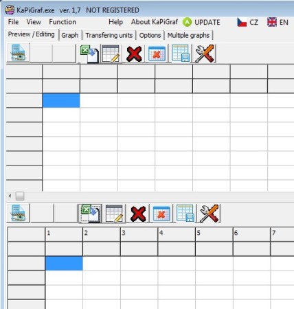
Screenshot above shows us the interface of this free Excel chart generator. All the important tools are available in the top left corner of the screen. Down below you’re gonna see two workspaces, where you can have open two different spreadsheets at the same time. In order to setup a diagram you of course have to have X and Y axis set, and with the help of KaPiGraf you can select and combine them from different spreadsheets. At the bottom of the window, additional options for tweaking the chart that you’re interested in generating are available, and also the main control buttons which are gonna initiate the creation process or export the create Excel spreadsheets, which is also supported. Key features of KaPiGraf are:
- Free chart generator – generate diagrams from Excel spreadsheets
- Excel editor – easily create new ones and edit existing spreadsheets
- Export the generated charts as images (BMP) or as files (BAT scripts)
- Works with both the 2003 and 2007 versions of Excel – XLS, XLSX
- Values for generating diagrams can be selected from multiple sheets
- Direct printing is supported – print charts directly from KaPiGraf
- Portable – can be used without installation, click and run
If you noticed the Not Registered caption at the top of the window titlebar on the screenshot above, that’s there because this free spreadsheet diagram generator is only free for personal use. Commercial use requires you to upgrade which also gives you more features like faster tech support and faster updates. Here’s a few pointers to help you get started.
How to generate diagrams from spreadsheets using KaPiGraf
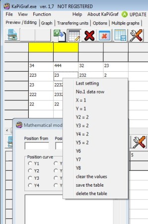
Either import spreadsheets by clicking on the File >> Open 1 or Open 2 depending on where you want to open it up. Values can also be entered manually. After you do that, you’re gonna have select values that you’re interested in using by right clicking on them and assigning them to either X or Y axis.
Mathematical function can be entered by selecting Function from the menu all the way at the top. For more detailed setup instruction, open up the accompanying readme file that comes with the app. When you’re done click Create graph in the bottom right corner.

If you’ve setup everything, chart should be generated, if not you’re gonna be warned about the errors that you’ve made, and of course they’re gonna have to be corrected.
Conclusion
KaPiGraf is the perfect tool for anyone who’s interested in generating highly customizable diagrams and charts from their spreadsheets. The only drawback is that not everything is translated properly to English in the interface, some tooltips for example, but nothing too important. Free download.

